Project Details
Brief
An electricity provider is dealing with an large number of customer calls / complaints during power cuts. To take some of the pressure off the CS team and reduce operational costs a rethink of it’s outdated power outage reporting map is required.
This was a response to an RFP and I was involved in the initial workshop and design concepts / rapid prototyping to win the full client engagement.
Role & tools
- ・Mobile UI/UX Design
- ・Sketching
- ・Wireframing
- ・Adobe XD
- ・Invision

Above: power cut map re-design with a social media integration
Process
During a kickoff workshop with fellow creative technologists, UX lead and stakeholders we identified that the power cut map was due a general UI/UX refresh and decided to concentrate our efforts on a mobile solution – given that the customer is without power and wants a power outage sorted urgently. We agreed on our goals for the sprint, primary personas and mapped out our solution keeping those in mind.
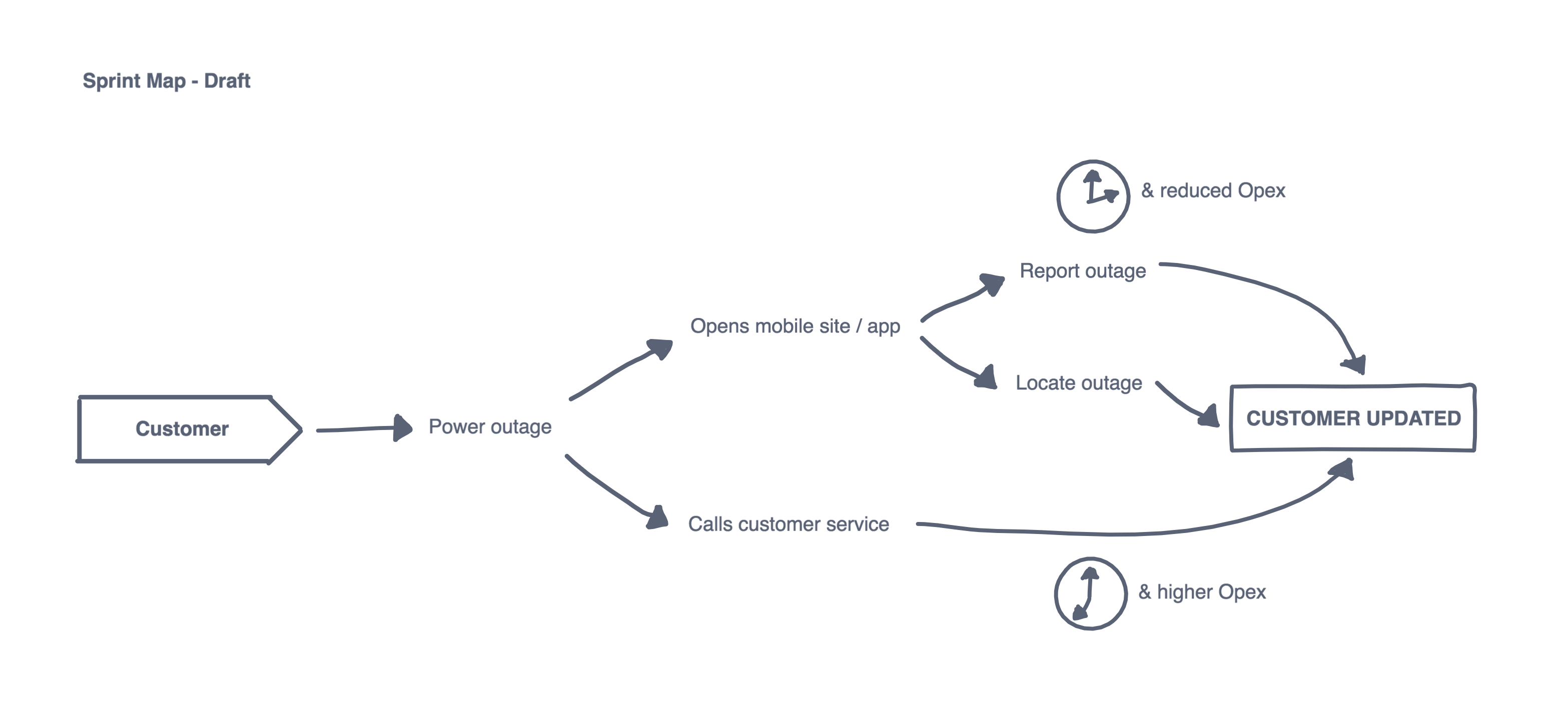
Above: design sprint map
I worked collaboratively with another senior Creative Technologist on the initial wireframing, for this we used Invision Freehand to sketch out our solution rapidly and together via a shared online whiteboard. We had defined two primary user flows for our demo – one in which the user would be directly geolocated from the outage map screen and information about a power outage promptly displayed. The other would go the AI chatbot route, this more innovative approach would have the added benefit of reducing both operational cost for the business and the need for our primary persona (as we defined below) to waste time calling customer service, or even end up in a call queue due to the sudden surge in calls.

Above: primary persona
We quickly got feedback and approval from colleagues and senior stakeholders and I was able to increase screen fidelity in Adobe XD as I had found it particularly fast to use in the past therefore an adequate tool for the job considering the timeframe. Certain effects / transitions I introduced in the UI (ie: background blurring / obscuration as often seen in iOs) reduce cognitive load and still retain context but also give it an overall sense of being more up to date with UI trends than the client’s current solution.
Some of the more detailed work involved rethinking current assets such as the colour coded pins which looked quite dated and blurry, aiming for better scalability by redesigning the entirety of assets as vector graphics. Another feature we introduced was social media integration, adding another source of updates and reassurance for our user, by keeping him/her connected with other affected users in their area.
Result
There had been some very encouraging initial feedback from senior colleagues and stakeholders, and I was told that the client was impressed with our pitch and design concepts. After a few weeks' wait we have finally received the good news that we have been chosen by the client as their preferred partner and have won the full engagement!🤘

Above: assorted prototype screens